The Process Behind Stop Action

So, as some may notice, I ended up changing my stop action project subject, theme, etc. Originally I was working with having those little glow-in-the-dark constellation stars making their way along the walls of my current apartment to picture window in my living room and landing in the my new place, via the balcony window. Unfortunately, lighting ended up being the downfall of this concept. The stars couldn’t provide enough light for the SLR I borrowed to pick them up as subjects. I split the project into thirds, the first of which was the movement of the starts out of my bedroom in my current apartment. I manipulated the lighting levels in this room by tweaking the blinds and durning off various combinations of lights to attempt to make the room look dark but still have enough light to be able to see the subject of the photos. However, I underestimated the amount of control I would have over the lighting levels in the two other shooting locations, and after three tries, was not able to get the SLR to take a photograph where there was enough light to see the stars.

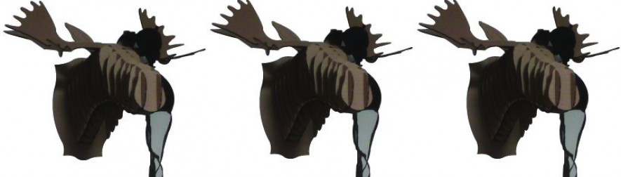
So, as an alternative, I decided to document the reconstruction of the cardboard moose in my living room, Count Winston Rothschild IV. Winston seemed like a logical choice, aside from lending his name to my class blog, because he’s a constructed entity with many parts. Winston also has a quasi-personality attributed to him within my room and my roommates and I view him as the moosehead over our TV rather than a bunch of cardboard pieces fitted together. I chose to shoot Winston in his “natural environment” of my living room because the blue university-stocked couches provided nice contrast and and a simple background while still providing a college-y feel to the shots. Also, I slightly overexposed the lighting in the area, as well as kept the shots slightly out of focus. Perfectly focused shots wouldn’t have provided very much more information to the viewer about what was being constructed and I didn’t particularly want a clean, professional look to this stop action.

In terms of music, I wasn’t able to find a particularly fitting audio selection for this film. I had two selections I was choosing in between for the stars, but that concept has a distinctly different feel to it, making those selections moot.

Reflection from Portraiture Now: Asian American Portraits of Encounter

The three artists I’m choosing to focus on in from the exhibit called Portraiture Now: Asian American Portraits of Encounter at the National Portrait Gallery are Roger Shimomura, Hye Yeon Nam, and Zhang Chun Hong. Mr. Shimomura uses bright, pop arty- colors and simplified shapes to create images of characters in popular American and Americanized Asian culture with his face or his likeness incorporated somewhere into the image. Hye Yeon Nam uses video and sound to transform extremely basic daily activities, walking, drinking, eating, and sitting, into physically tedious, confusion-inducing events and thus creating commentary on cultural expectations. Zhang Chun Hong featured charcoal drawings on scroll of long, black women’s hair and thus creating commentary on life and vitality.


Within this exhibit, each of these artists serves very different purposes.

Mr. Shimomura’s work provides a Haring-esque energy from clean colors and bold black lines and frames on every piece featured. Images featured are either an iconic American image, such as Leutze’s George Washington Crossing the Delaware, as seen through a lens of more traditional Japanese art. Mr. Shimomura places himself as the figure in profile facing the left side of the frame while standing in a boat in colonial garb. However the figures rowing the boat differ greatly from Leutze’s original image in that, while they perform the same action, they are the greater focal point of the piece. The nine figures tasked with rowing the boat are portrayed in much less detail than Mr. Shimomura does for himself, but express emotions of frustration and anger. One could go as far as saying the painting conveys a message of Japanese labor and innovation being used to high-lauded American ideals.

Mr. Shimomura’s other works make similar commentary from cartoon characters either Japanese in origin and adopted by American society such as Hello Kitty and Pokemon, or racist American caricatures of Japanese culture. The choice of white walls with indirect lighting with shaded windows conveys a matter-of-fact tone within the display, as though Mr. Shimomura would like the viewer to take his art at face value rather than reading too deeply beyond the surface.

Ms. Nam’s work is able to evoke emotion due to its multi-media nature. First, there is confusion for why she has displayed video of such simple actions in a national art gallery. Then discomfort because the artist continues her activities once the view has identified her unusual nature of going about the task. Finally, the viewer experiences humor by connecting with the artist over a shared metaphorical or actual strife in her activities. Ms. Nam does not offer any resolution to the issues brought up by these activities. She never removes the planks from her feet in Walking. She never becomes frustrated with balancing the tomatoes and simply eats with her hands in Eating. She never moves to a more stable chair in Sitting. The display choice of flat monitors on white walls with seating in the center of the room seems a bit generic, but it works. If Ms. Nam had chosen to perhaps create individual viewing stations for each video or utilized stronger or weaker levels of lighting than what is natural, her work would have taken on a much different tone, inducing the viewer to see each work as a commentary on their individual person rather than a cultural commentary.

Ms. Zhang’s work evokes a more serene and calm feeling than the other two artists within Portraiture Now I’ve focused on. Her charcoal drawings maintain an aire of femininity and softness that all of the artists within Portraiture Now were not able to convey. The pieces featured are evidently influenced stylistically by Chinese ink drawings on scroll, but charcoal is not a traditional medium. Her larger than life portrayals of the back of a woman’s head show hair at least five feet in length, indicating vitality and long life, at least with which to grow hair that long. Her display choice of slightly dimmed overhead lighting, shaded windows, and soft spot lighting bring a softer tone to this subsection of the exhibit.

These three artists function together within Portraiture Now: Asian American Portraits of Encounter from the cultural commentary they portray, perhaps as contrasted with the culture of their country of origin or heritage. 

Logos- in color!

So the assignment for today involves corporate logos that utilize effective design with color. Here’s what I came up with: 

1. Tide 

This logo incorporates primary colors and concentric circles to give the design an almost vintage-y feel. The ascending baseline for each letter gives the logo a sense of movement. While the design is very simple, it’s distinctive enough for me to remember it from design classes I’ve taken in the past. 


2. BP

While BP is not exactly the most popular of the big oil companies (not that any of them are popular), they still have a darn effective logo. I distinctly remember sitting in the passenger seat of my dad’s car in late 2001 and seeing the new BP flower on one of the local gas stations. Considering that I was an 11-year-old kid at the time, my reaction was “Ooh! Look at the pretty colors!” But even now, following the gulf oil spill in 2010, I still can’t manage to shake the positive association I have with this logo. 


Anheuser & Busch 3. Anheuser & Busch

In downtown Saint Louis there is a huge light-up billboard along one of the major highways that portrays the A&B eagle flying through a capital “A”. This logo has reached an iconic status because of its Americana themes and the fact that it’s been around practically for forever (1872, to be exact.) In the central midwest, it’s an overall symbol for beer. I honestly thought that all beer was Budweiser  until after I was 10 years old. The bold primary colors and distinctive serif on the font make this logo memorable. 

Practices of Looking

Hello All. So this week’s assignment was to chat and reflect on our reading from chapter 1 of Practices of Looking. A section on the myth of photographic truth got me thinking about how the photographer’s point of view plays a huge role in how the subject is portrayed. I was originally going to say something slightly shallow about how Oldenburg & Van Bruggen’s Spoonbridge and Cherry in the Minneapolis Sculpture Garden. Basically, the angle from which a photo is taken can make this sculpture look giant or tiny, depending on foreground reference points and conventional norms for the objects represented. The sculpture is pretty cool in person, but photos of it really can’t show any emotional depth. So I’ll bring in something that should evoke an emotional response from anybody with a soul: a picture of a baby.

Dramatic Baby

Well, I’m the baby in this photo, but don’t let that deter you from ooh-ing and aaah-ing. And the photographer is my dad. My father is one of the most devoted parents on the planet, so I’m pretty sure his thought process when taking this photo was something along the lines of, “I must document every movement of my week-old, first born child because the miracle of life is amazing,  I am so incredibly happy, and I love my new daughter.” If he had wanted to take a more artistic photo, he could have photographed me from the side in high contrast black and white. If he had been going for a clinical angle, he would have sought out a photo with me making a relatively neutral expression, not flailing my limbs around, and on a background with less visual noise. (This photo album contains 93 other photos of me in the same onesie, speaking to my interpretation of my father’s thoughts.) The point is that any photo can be taken in a multitude of different ways that completely depend on what the photographer was thinking when shooting and what information they want you to gain from looking at the image.

And finally, one last cute baby picture.

Julius Caesar Baby

Explanation of the Craziness…

No, I’m not blogging from the point of view of a moose. I’m just not being all willy-nilly with my identity on the big, scary world wide web. So my lovable piece of cardboard taxidermy will just provide that small bit of identity all readers crave, even if my only reader ends up being my art professor for who’s assignments I started this blog. Just to give you some background on Winston, more formally known as Count Winston Rothschild IV:

– He resides on the wall over the TV in the living room of my apartment.

– He is also notoriously slick with the ladies. One will usually see Winston with a lacy bra haphazardly flung over an antler.


So yes, Mazel Tov! I suppose this is the ceremonial post analogous to breaking a bottle of champagne on the side of a ship on its maiden voyage. Except with a lot less to celebrate.